180 Studios
UVA: Synchronicity
- Brand Identity
- Environment
- Exhibition Design
- Type Design
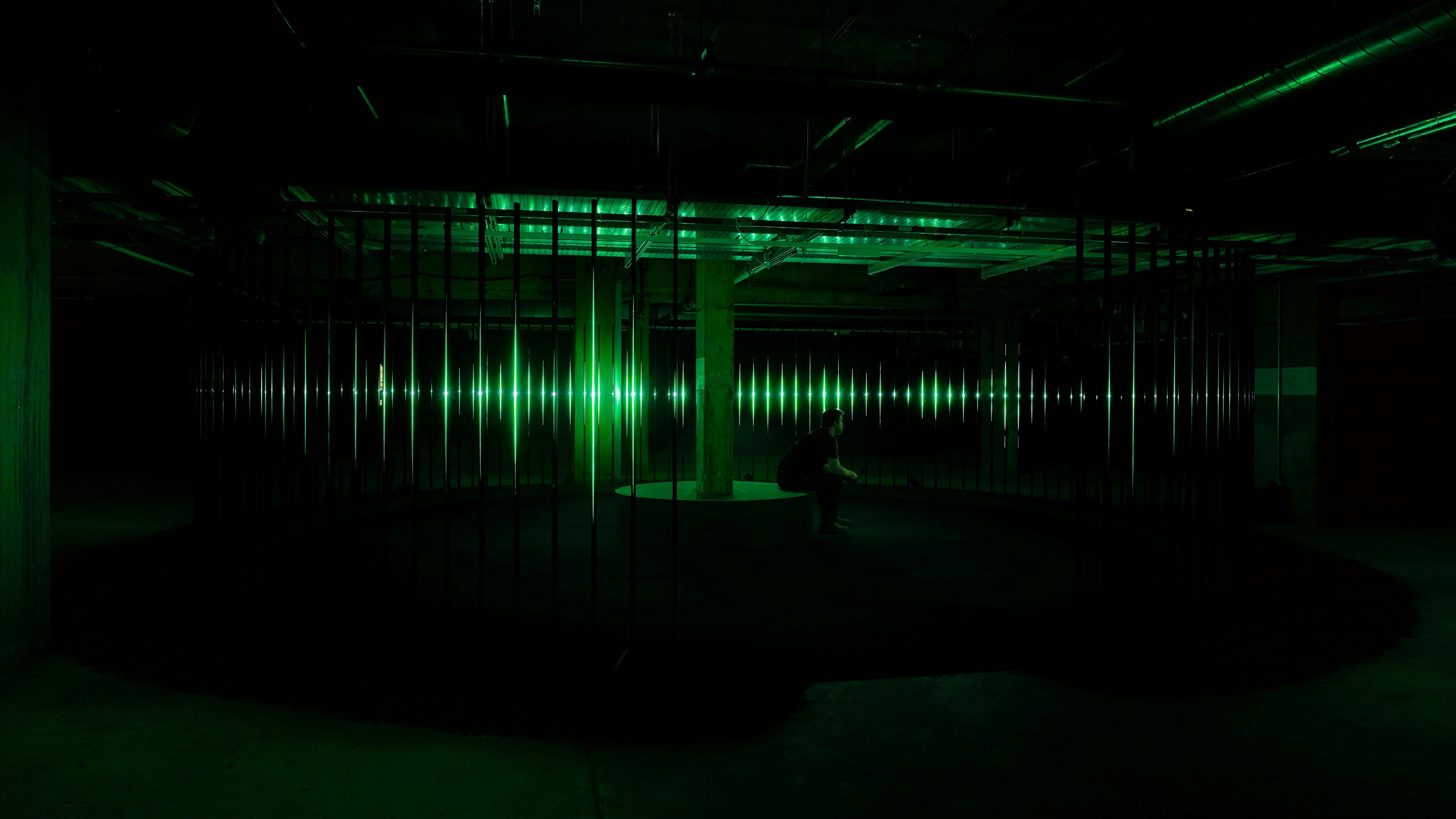
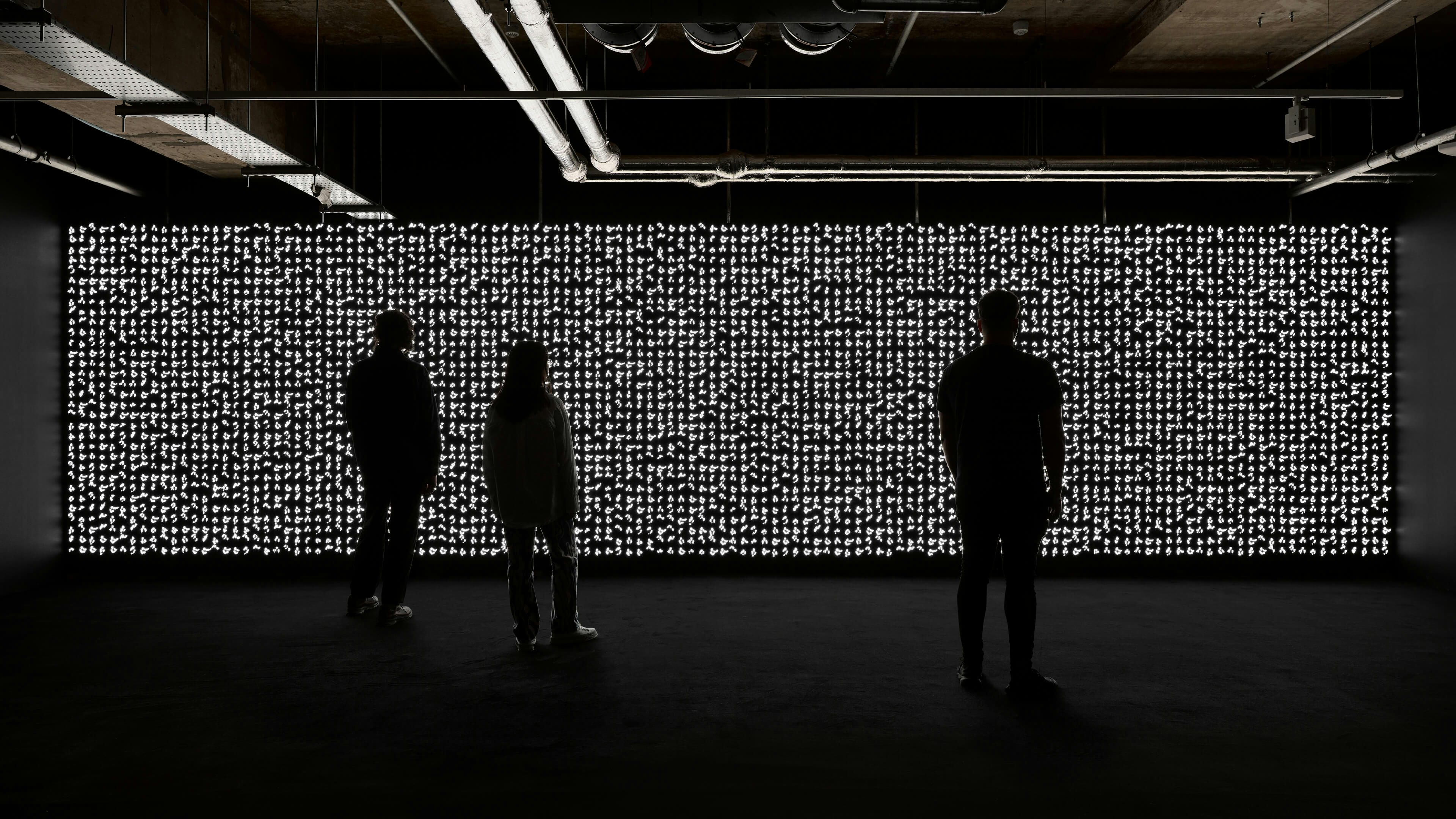
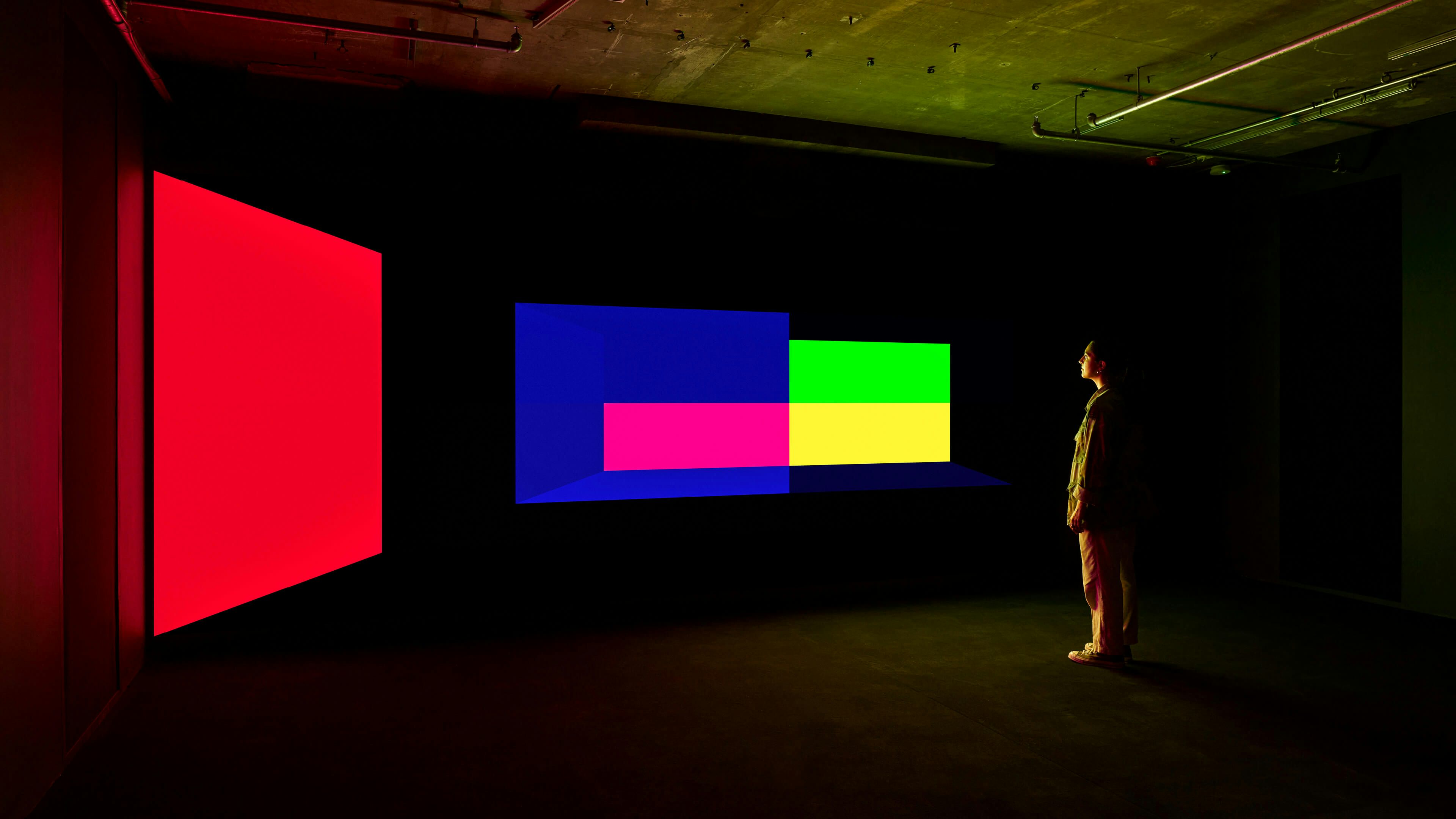
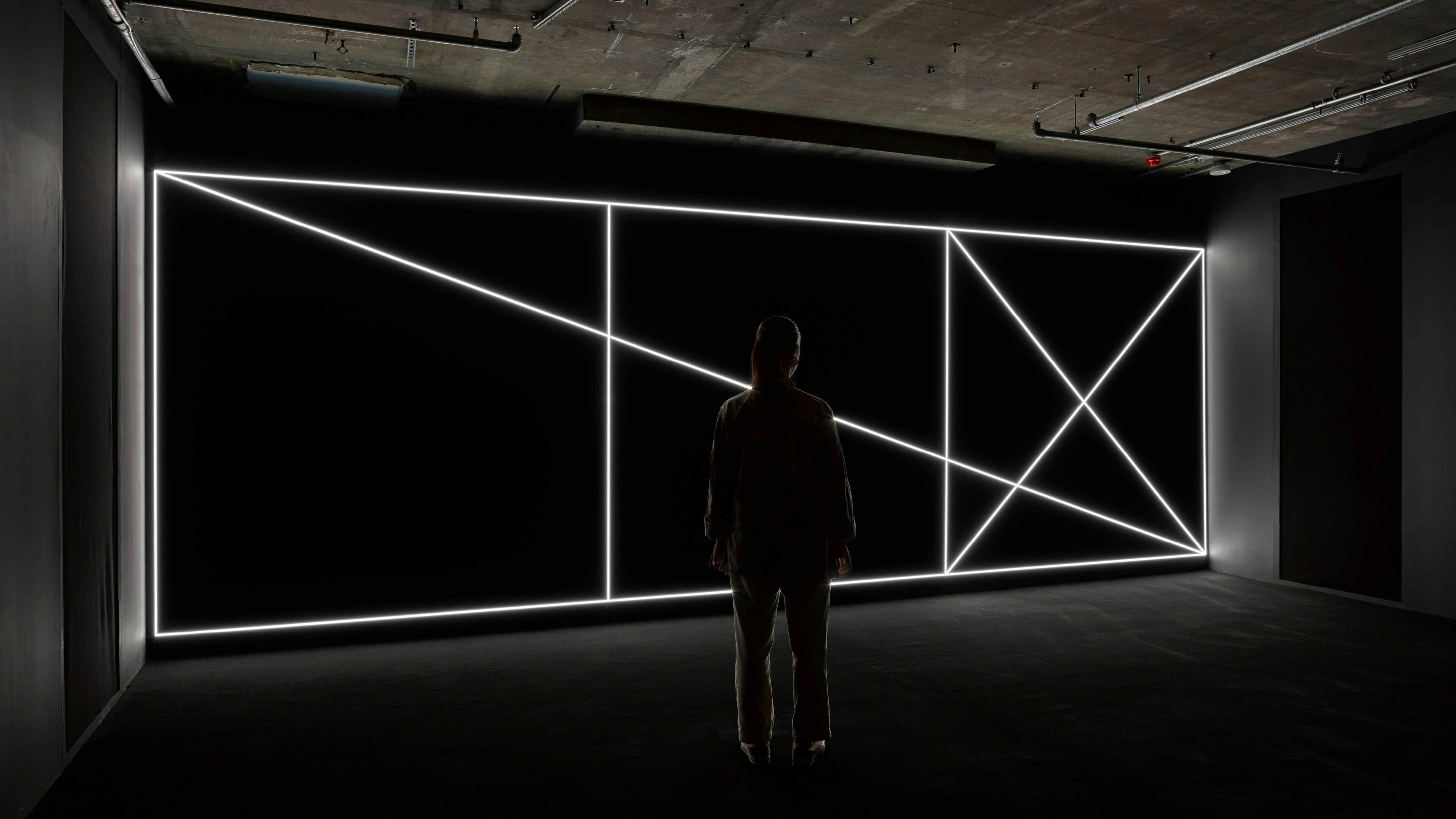
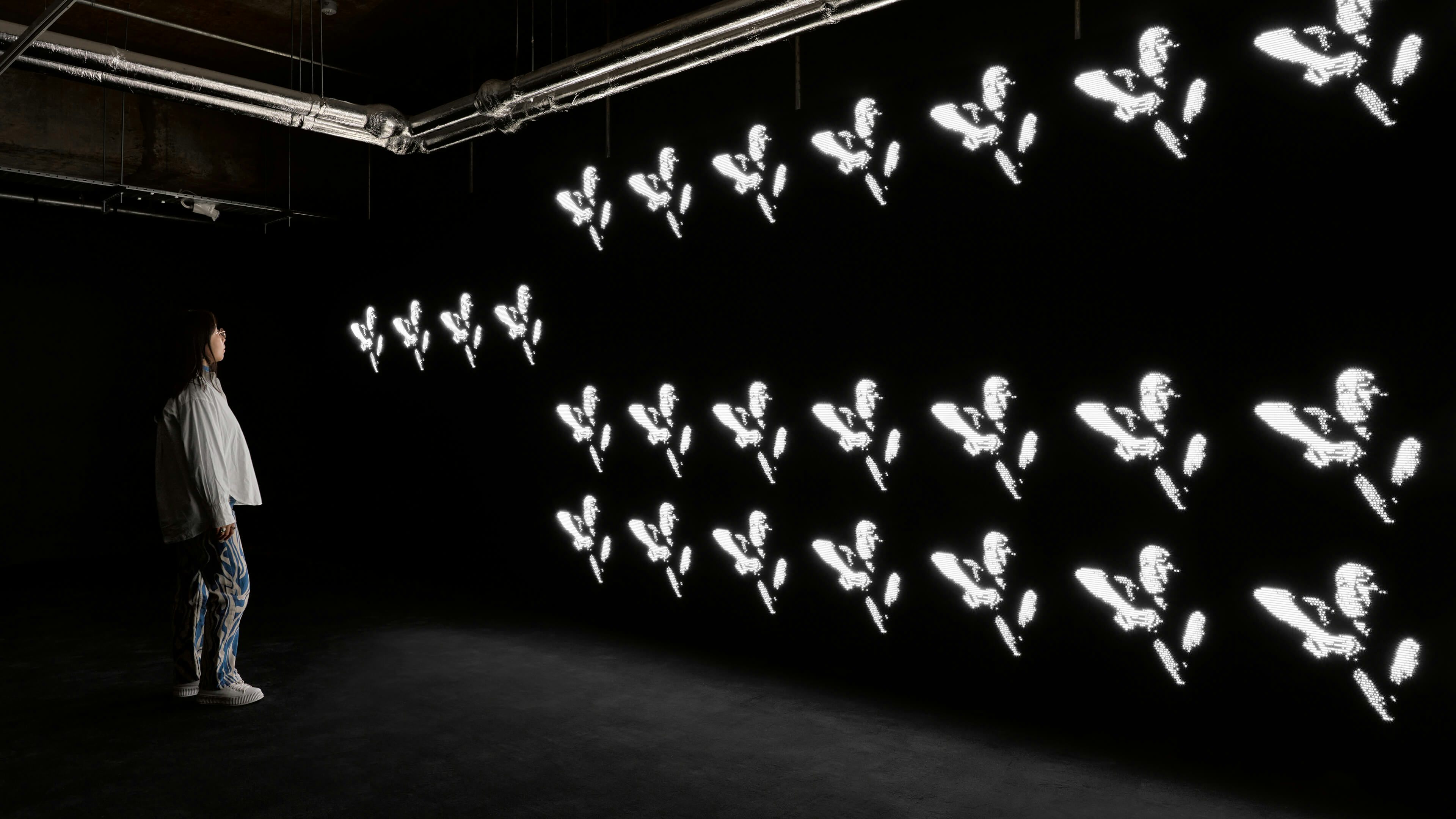
London-based collective United Visual Artists (UVA) has helped define a generation of media artists working with light, space, sound, and code for the last twenty years. Under the guidance of British artist Matt Clark, UVA’s multimedia practice investigates the nature of perception and cognition, reflecting the ways we attempt to understand and make sense of the world, and our place within it. Drawing on their background in live performance, UVA create “choreographed environments” that transfigure architectural space.
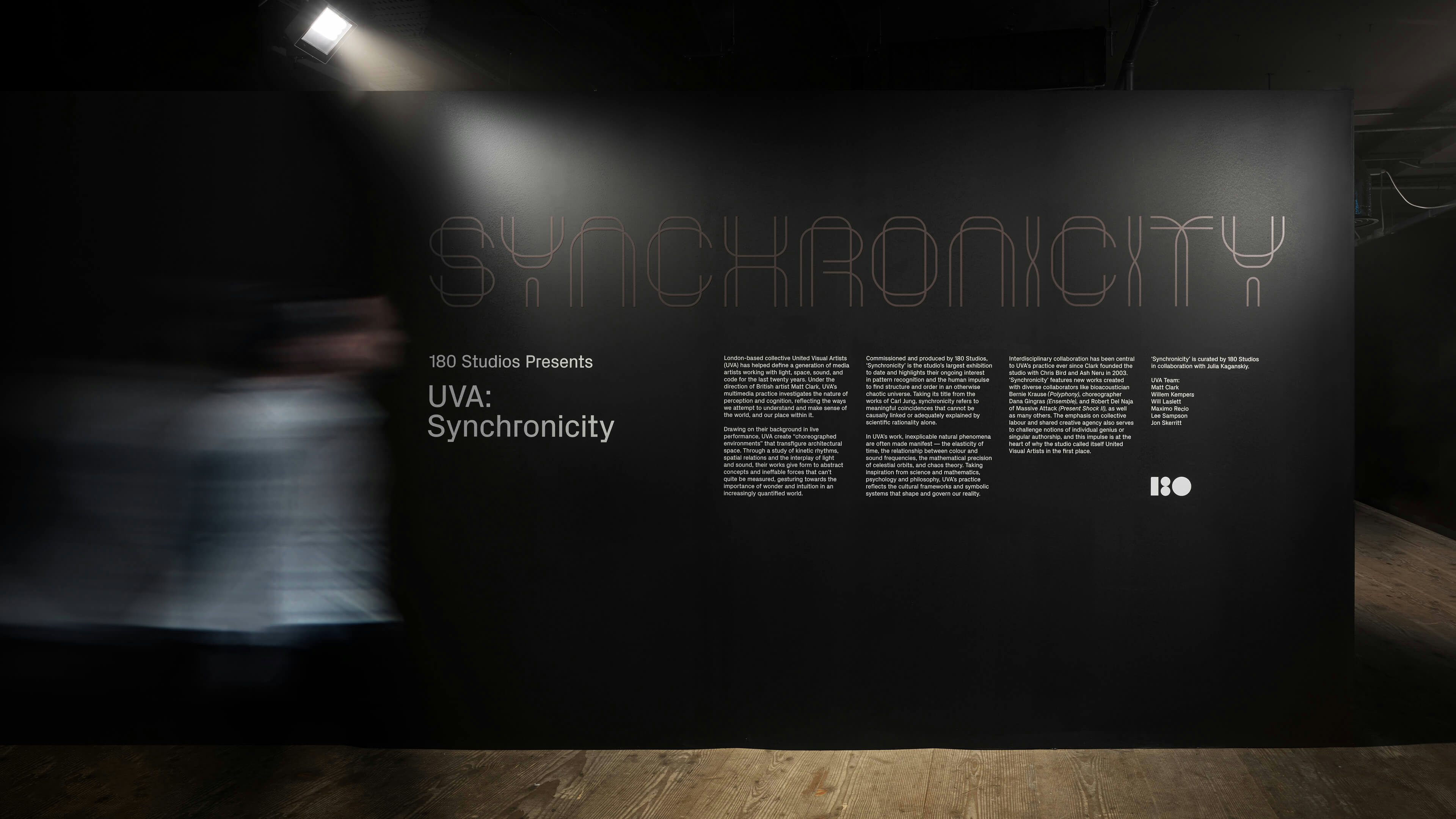
Presented by 180 Studios, UVA have now unveiled their largest ever exhibition. Marking the artist’s 20th anniversary, UVA: Synchronicity occupies the subterranean spaces of 180, featuring eight new, large-scale immersive works. HS was commissioned to design the identity, exhibition graphics and accompanying catalogue.
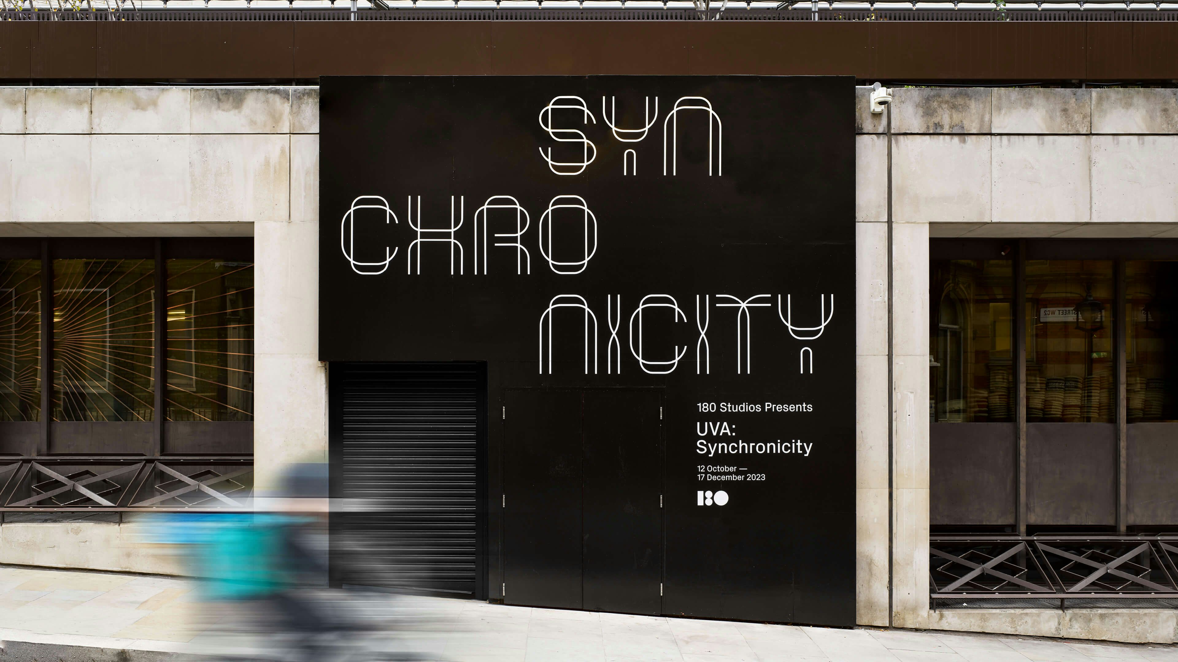
At the heart of the Synchronicity identity is a bespoke, dimensional wordmark. Constructed from two interwoven parts, the letterforms themselves take inspiration from the origins of Kinetic art, specifically the work of Naum Gabo and Antoine Pevsner. Kinetic art continues to be an enduring influence in UVA’s working practice.
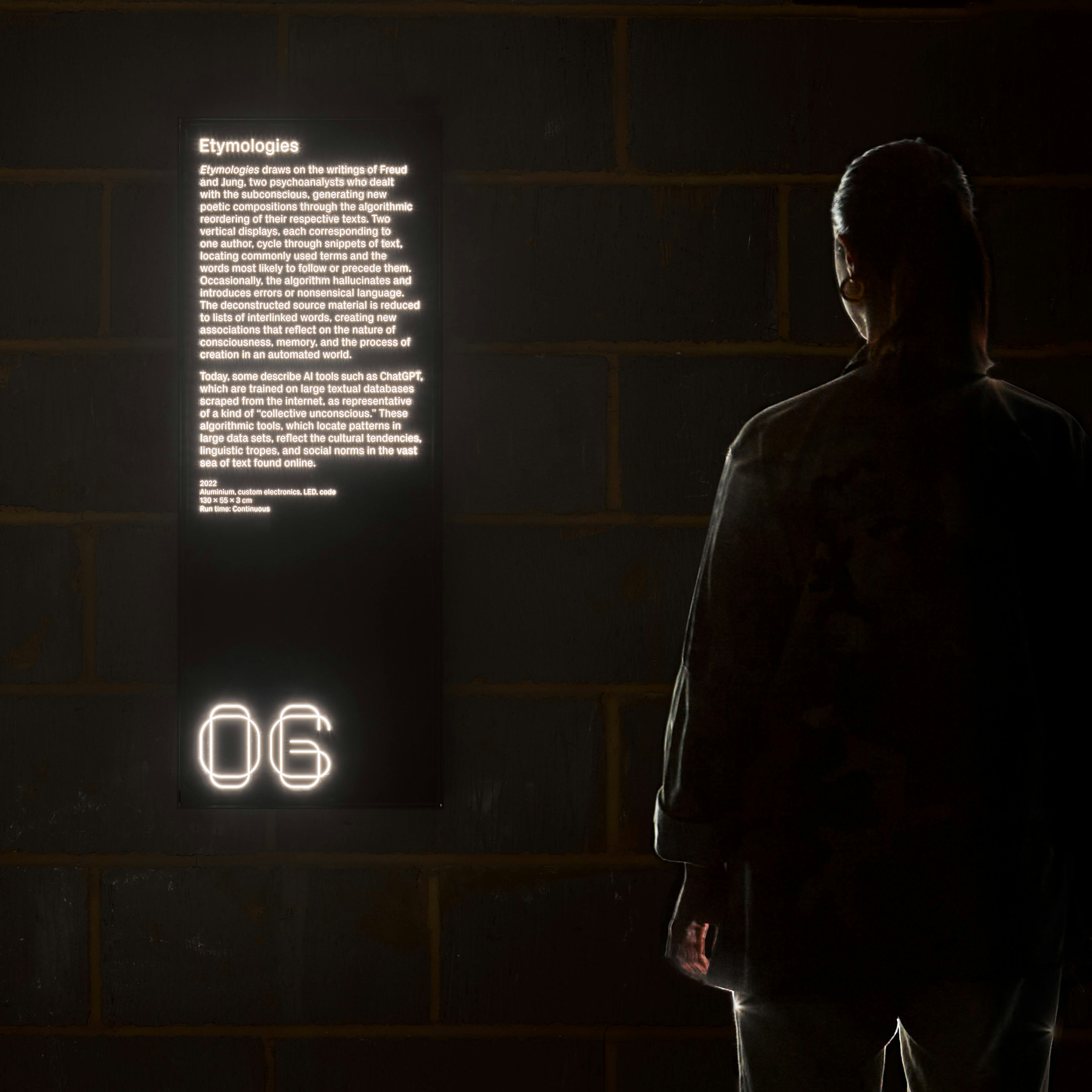
The typographic language is extended into the physical space across exhibition graphics and wayfinding. Written texts about each of the works are encased in a series of bespoke lightboxes, that present the words in an illuminated state – giving the appearance that the text is floating in the darkness, whilst also serving as a visual guide to lead visitors through the exhibition space.
Credits
UVA: Matt Clark, Willem Kempers, Will Laslett, Maximo Recio, Lee Sampson, Jon Skerritt
Studio / Project Manager: Poppy Heron
Technicians: Blaise Anthony, David Li, Joseph Lyons, Freya McArthur, Yannis Petridis
Curation: 180 Studios in collaboration with Julia Kaganskiy
Graphic Design and Identity: Hingston Studio
Production: 180 Studios
Exhibition Photography: Jack Hems and Mark Cocksedge
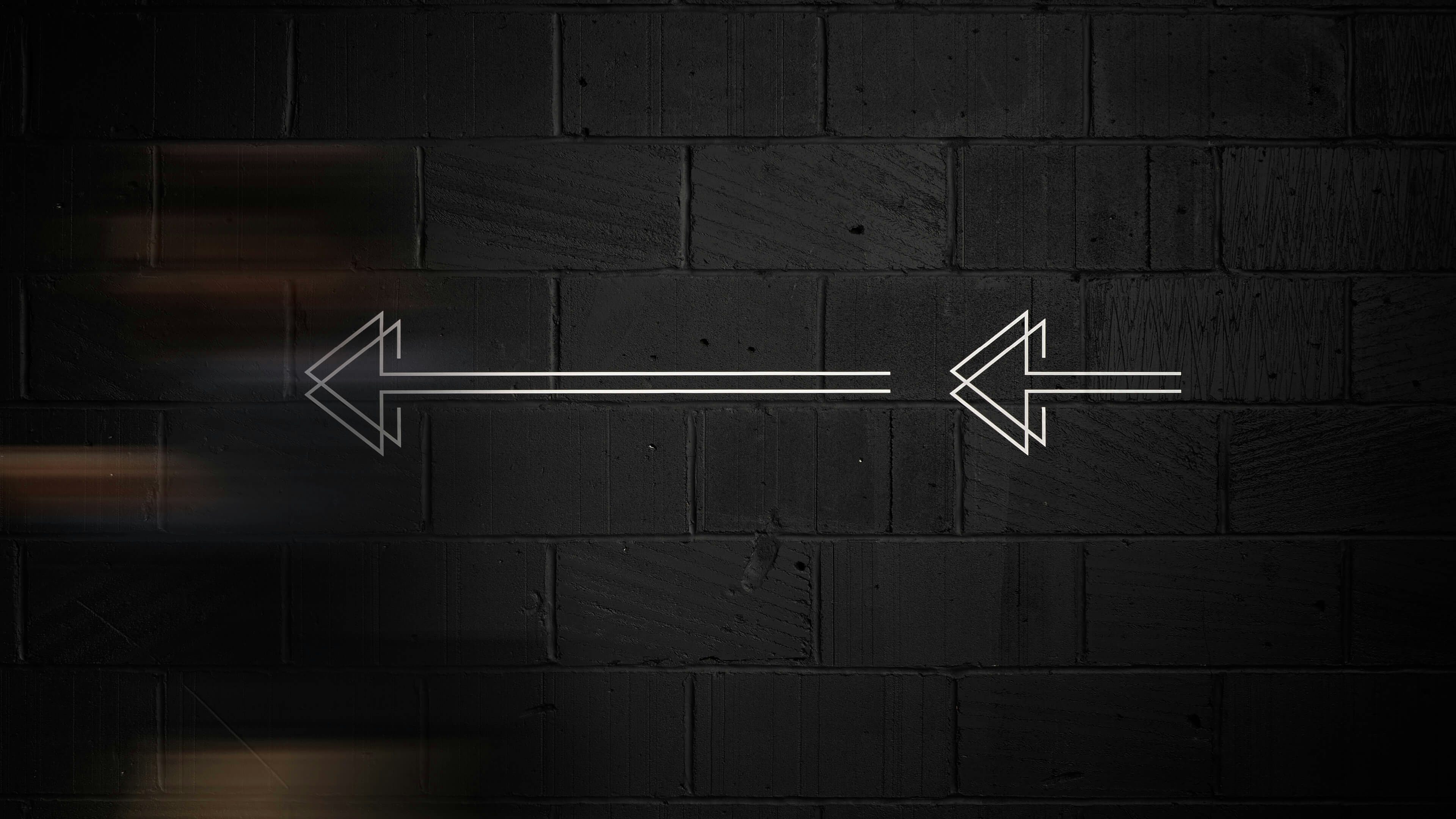
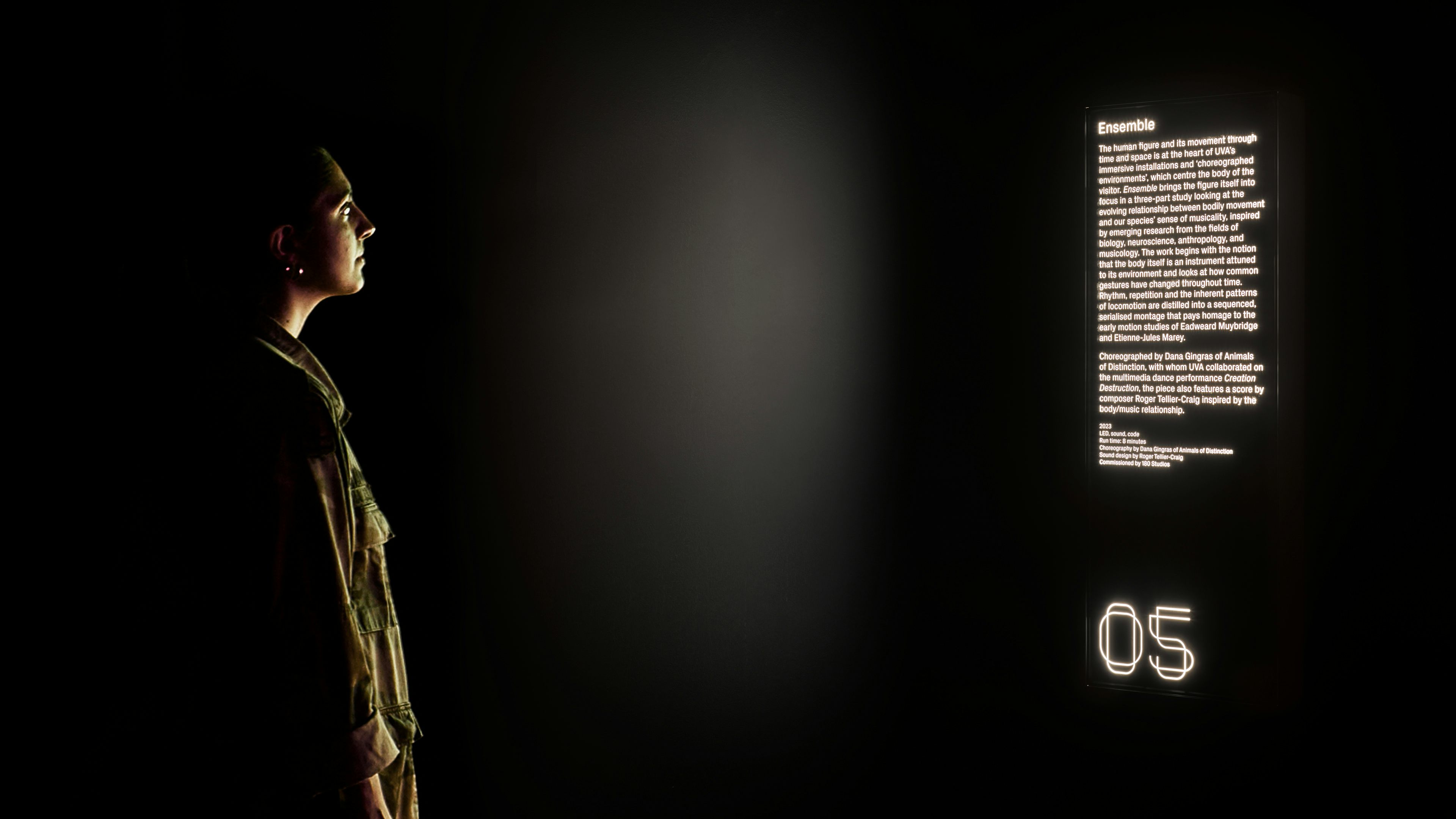
The typographic language is extended into the physical space across exhibition graphics and wayfinding. Written texts about each of the works are encased in a series of bespoke lightboxes, that present the words in an illuminated state – giving the appearance that the text is floating in the darkness, whilst also serving as a visual guide to lead visitors through the exhibition space.